Getting Carried Away
Bringing up the topic of what you want to happen to you when you pass away is awkward enough as it is, without graphic designers making it even worse. You want to approach the matter in a light, but respectful manner. After all, this is a sensitive topic to bring up.
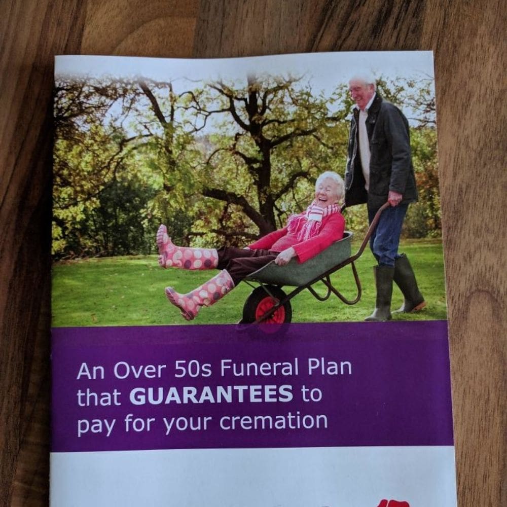
Enter a photo of Grandad pushing Grandma around in a wheelbarrow, you know, as if he were carting her off to her final resting place. Not quite the image you want your children to have in their head as they’re discussing your final wishes. I’m pretty sure that this was not part of the brief he was given.
Pages: Page 1 Page 2 Page 3 Page 4 Page 5 Page 6 Page 7 Page 8 Page 9 Page 10 Page 11 Page 12 Page 13 Page 14 Page 15 Page 16 Page 17 Page 18 Page 19 Page 20 Page 21 Page 22 Page 23 Page 24 Page 25 Page 26 Page 27 Page 28 Page 29 Page 30 Page 31 Page 32 Page 33 Page 34 Page 35 Page 36 Page 37 Page 38 Page 39 Page 40 Page 41 Page 42 Page 43 Page 44 Page 45 Page 46 Page 47 Page 48 Page 49 Page 50 Page 51