When No Means Yes
You would think that modern technology would have enhanced our air travel experience, but the reverse is true when we run into design flaws like the one in Air France’s app. The in-app experience can differ vastly from a company’s website, forcing us to toggle between the two, but we’d at least like to have the choice.
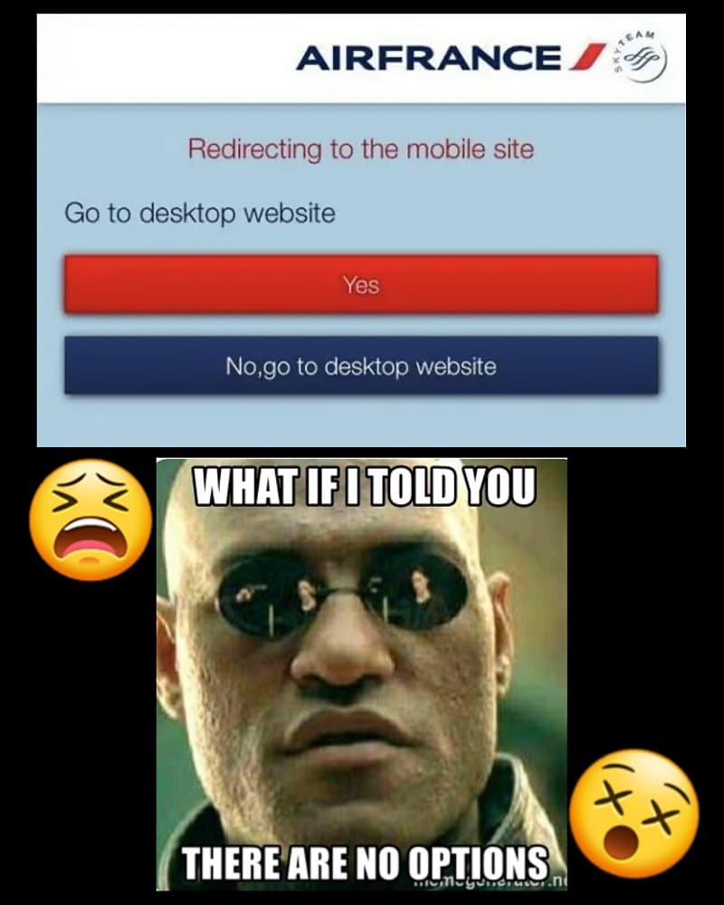
Here, we see Air France’s mobile app prompting the user to go to the desktop version of the site, or in other words, the internet rather than the app. They are given two choices: a simple, compliant “yes” or a “no” that will redirect them to the same destination as the “yes” option. They’re trying to make us feel like we have a choice, but we know better.
Pages: Page 1 Page 2 Page 3 Page 4 Page 5 Page 6 Page 7 Page 8 Page 9 Page 10 Page 11 Page 12 Page 13 Page 14 Page 15 Page 16 Page 17 Page 18 Page 19 Page 20 Page 21 Page 22 Page 23 Page 24 Page 25 Page 26 Page 27 Page 28 Page 29 Page 30 Page 31 Page 32 Page 33 Page 34 Page 35 Page 36 Page 37 Page 38 Page 39 Page 40 Page 41 Page 42 Page 43 Page 44 Page 45 Page 46 Page 47 Page 48 Page 49 Page 50 Page 51 Page 52 Page 53 Page 54 Page 55 Page 56 Page 57 Page 58 Page 59 Page 60